

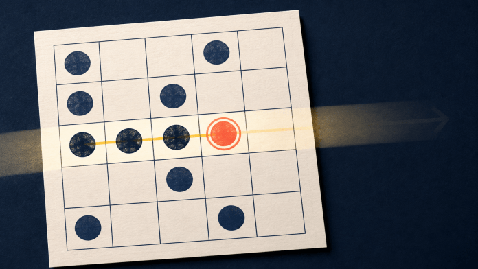
A bingo card can be understood in seconds, yet following it during play demands repeated bursts of attention. Each call sends the eye across a grid of similar squares, then back to the developing pattern before the next call arrives. A readable card keeps the current target, confirmed marks, and unfinished line visually separate. When those states share the same color, shape, or emphasis, checking replaces recognition. Clear card design therefore depends less on decorative polish than on how quickly a player can locate one item and register what changed.
Color can separate states, but it should not carry the entire message. In 2025, the Accessible Games Initiative introduced 24 accessibility tags covering features such as large text and color alternatives. Bingo cards present a similar communication problem on a smaller surface: a square may be unmarked, newly matched, permanently marked, or part of a nearly complete formation. If each state differs only by hue, glare, reduced color perception, or a low-contrast theme, the distinction may be lost. An outline, symbol, or type change preserves it without requiring brighter colors everywhere.
What the Eye Has to Find
Every bingo grid contains a target and distractors. The target is the number or item just called; distractors are the other cells that share its shape, color, size, or position. Finding the target is only the first task. The player must also recognize whether the cell is unmarked, newly marked, or already part of a developing pattern. Contrast, spacing, scale, and emphasis create a visual hierarchy that directs attention from the call to the matching cell and then to the wider grid. When that hierarchy is weak, similar elements compete, and the same information needs checking again.
On a screen, each bingo call begins a compact sequence. The player receives the target, searches the card, confirms the match, registers the mark, and checks whether it extends the required pattern. In screen-based bingo games online, that sequence unfolds inside a changing digital display, rather than across a card and physical markers. The called item needs brief emphasis, but the resulting mark must remain legible after that emphasis disappears. A flashing border can identify the current target; a stable icon or fill can preserve the completed state; a continuous edge or highlight can reveal progress across a row, column, or other formation. These signals need separate visual jobs. If the newest call and every previous mark use the same treatment, the eye must reconstruct the order of events. If decoration resembles a mark, the player may check the same cell twice. Redundant cues, such as color paired with an icon, reduce ambiguity while leaving the pattern visible between calls.
A fall movie bingo card replaces compact numbers with titles of uneven length inside a 5-by-5 grid. Firm cell boundaries hold the structure together, while centered labels give the eye a predictable place to begin each search. Longer entries occupy two lines, increasing the variation from one square to the next. The orange palette also leaves limited room for a marked state that relies on color alone. A persistent symbol, strike-through, or border change would remain distinguishable without competing with the autumnal illustrations surrounding the grid.
View this post on Instagram
Four Checks for a Readable Card
A quick card audit can separate four sources of visual effort:
- Target clarity: The latest call should differ from nearby information at a glance. Temporary emphasis also needs to look different from a completed mark.
- State contrast: Marked and unmarked cells should remain distinguishable without color alone. Shape, outline, texture, or a small symbol can carry the same status.
- Line continuity: Progress should be traceable across the required formation. Heavy illustrations, inconsistent spacing, or marks that cover labels can break the path between adjacent cells.
- Status redundancy: A brief movement can draw attention to a change, while a stable cue records it. Motion alone disappears; a permanent cue alone may be easy to miss at the moment it appears. A combination can therefore be more effective.
A change that helps one task can obstruct another. Enlarging every label may improve individual words but push the whole pattern beyond one comfortable view. Raising contrast on every element can make no single state prominent. Thick borders may define cells while fragmenting a line that should read continuously. The best adjustment depends on whether the failure occurs during target search, mark confirmation, or pattern tracking.
When Decoration Competes with Status
Themes add atmosphere through pictures, typefaces, and color, but each extra feature becomes another possible distraction. A leaf behind a label may resemble a diagonal strike. A glow around every cell can make the newest call difficult to isolate. Animated backgrounds may pull attention away at the exact moment the card changes. Decoration causes less interference when it stays outside the label area, respects cell boundaries, and remains visually quieter than live status cues.
Text density changes the task as well. A 2-digit number can often be recognized by shape before it is read fully; a film title or phrase requires word-level identification. Consistent alignment helps because the eyes begin in the same place each time. Predictable line breaks and enough space around the text prevent neighboring squares from appearing connected. On a smaller display, reducing non-essential ornaments usually preserves more clarity than shrinking every label to keep the artwork intact.
Density Changes the Search
A 2025 visual-search experiment involving 75 adults presented displays containing 5, 15, 25, or 40 objects. Search times rose with display size when participants had to identify a target through a combination of features, but stayed comparatively stable when a single feature made it stand out. The experiment used gamified cognitive tasks rather than bingo cards, so it cannot measure bingo performance directly, but it shows that a uniquely marked square can pop out, while a target sharing color, shape, or typography with several neighbors requires item-by-item checking.
A card should reveal its latest change without hiding its history. When the target, permanent marks, and developing pattern remain distinct, the player can follow the round instead of repeatedly rereading the grid.